Telling a story and telling a story with data are similar, but also different. And many of the differences are points that people don’t consider. In this blog, we’ll try to break down the components of storytelling with data in an effort to share main points to include in your own presentations or things to consider when trying to run your own analytics for a recommendation.
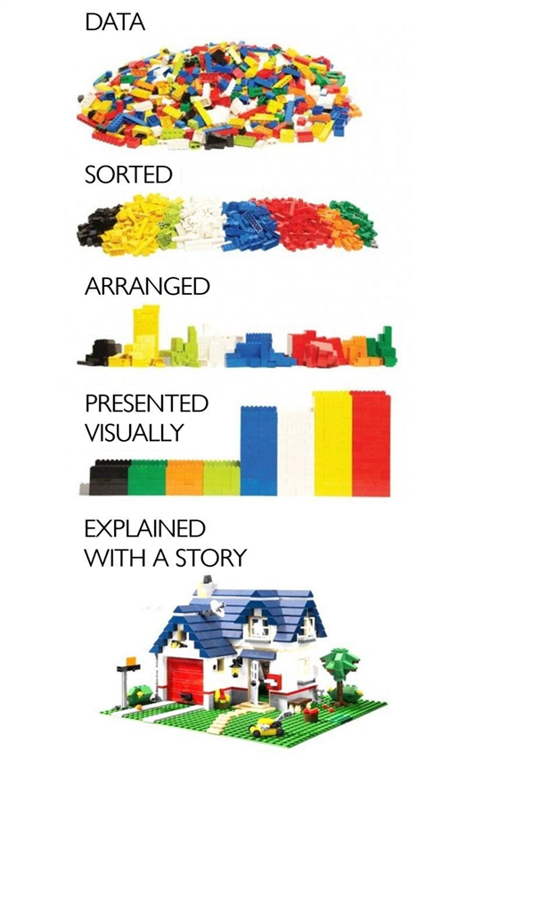
Why Is Storytelling With Data Important?
I’m Michael Roberts, Vice President at SPK and Associates. I’ve sat in more meetings than I can count over my career where someone is trying to influence leaders, managers, and/or executives to say ‘yes’ to something. In the process of showing a bunch of data, those presenters expect the data to speak for itself.
Data Doesn’t Speak For Itself
Unfortunately, many of those presentations have flopped. Inevitably, the presenter walks out dejected. Over the years, I’ve seen these situations too often (sometimes it was me walking out dejected). In the process, I’ve realized a few things:
- The data presented is usually accurate but is too complex to be meaningful.
- It needs to be brought to life through visualizations, and storytelling.
Storytelling With Data Is An Art We Aren’t Taught, But Can Learn
A client I worked with for about 5 years has a very large onboarding training program for staff they hire right out of college. The individuals they hire are in around the top 5% of colleges and universities globally. Needless to say, they are ‘smart people’. But, I found it interesting that one of the first onboarding sessions the graduates received was “how to deliver presentations”. Within this training they are taught:
- How to speak to peers or leaders in a presentation setting.
- Use confidence monitors so they never turn their back on the audience whilst presenting.
- Project their voice.
- Not to talk over co-presenters.
These are small but very important things when it comes to presenting your ideas or recommendations. Why? Because the audience is judging your presentation skills as much as they are the content of your presentation. But, they weren’t taught the art of storytelling with data.
Brent Dykes, noted author and data science guru defines data storytelling as a “structured approach for communicating insights to a target audience using narrative language and explanatory visuals.” I love this definition. It’s a simple explanation and contains all of the major components important for presenting potential outcomes. Additionally, it means you are doing this whilst integrating data into your presentation.
Let’s break down the things you’ll need to do it correctly.
How To Start Storytelling With Data
In the course of business, people run across an outcome that they like, or they don’t like. Then, they either want to repeat it, or avoid it again. For example: “When I push button x, something good happens. But, when I push button y, something bad happens. So, let’s stop pushing button y and only push button x from now on.”
Now, it’s never that simple, but this is just to illustrate my point. There is a business outcome that is desired. And, individuals will use data to point to the business outcome.
Identify Your Data Points
Let’s say we have data that supports that pushing button x is a good thing. My first thought is “I want to be my own critic.” I want to ensure I have all the data possible to disprove my theory that button x is good and button y is bad. I’d ask questions like…
- How many times has button x and y been pushed?
- What are the circumstances where button x and y are pushed?
- Who pushed each button?
- What data points do we have around the situations in which those buttons are pushed?
- What is the history of each person that pushes those buttons?
- Do we have anomalies or data points that disprove my hypothesis?
- What percentage of time does that represent?
The more questions you can answer, the more data points you should have.
As you learn more about those data points, a story should start to tell itself. Then, you can make a hypothesis, and test that hypothesis with the data points. Sometimes, you may find that data points don’t exist for certain scenarios. In those cases, you’ll want to update your system, application or process to start capturing data immediately. Then, you’ll have data points for a future review. Lastly, you should understand what data points are available to test your hypotheses.
Define If Your Data Contains Context
In the pursuit of finding the right recommendation from your data intelligence, you need to define if the data itself has context. This grants the ability to find a network of connections between data points. Those connections may be created as metadata or simply identified and correlated. Contextual metadata adds value, essentially making it possible to receive information from data.
Identify The Most Powerful Visuals For Your Story
Some data visualizations are better than others. It depends on the context and audience receiving the presentation. For example:
- Google determined business users and marketers are interested in a few specific data points on its Google Ads platform.
- These include the number of clicks and impressions in a specific period of time. ( i.e., day, week, month, custom date range, etc).
- Additionally, they are interested in the total cost and average cost per click of each of the clicks in the campaign.
So, Google made a simple dashboard that shows these along with a short graph. There are many more data points business users can dive into too. But this visualization is one that has resonated with business users.

More technical users may be interested in visuals that highlight the data you want to show. In parallel, they may want to view the data that’s “under the hood” of your visualization. Give them the insights to determine their own outcome that may map to yours and validate your hypothesis.
Tailor Your Visuals For The Audience
To determine the best visualization for each situation, you should consider a few points:
1. Choose the most appropriate way to provide your visualization. For example, don’t print a chart in black and white when the chart has color. It devalues any meaning you’re attempting to convey.
2. Provide necessary context around the visuals you decide to provide. Tell the audience about the data they are seeing depicted. And, explain how that data was collected and analyzed.
3. Another important part about visualization is to keep it simple and clear. The KISS method has always worked well for me here. That includes being brief in your presentation of the data. It also includes avoiding unnecessary, irrelevant, or additional information than that being shown or/discussed.
4. Pay attention to the color palette being used. Bad colors can skew the presentation or individuals can miss important points you’re making if the color palette is not well-defined. There are an estimated 300 million people in the world with color vision deficiency. That’s 1 in 12 men and 1 in 200 women. To select good colors, use natural colors. This allows for easier and faster digestion and comprehension of your point. For example, when displaying a graph, use different shades of particular colors like blue or green to show a profit for a specific month. The brightest blue or green should be for a month that has the highest benefit.
Visualizations are massively important in storytelling. Comparatively, be sure to use graphs, charts, and other visualizations to support easy and clear messaging. The goal here is to focus your audience’s attention. You can’t do that with a bunch of extra data points on a slide, too much text, or too many visuals. Simplify your approach story for a powerful narrative.
Storytelling With Data Like A Pro
It’s time to rehearse the story when:
- You’ve confirmed your data is accurate.
- Your data has context.
- You’ve organized the visualizations to map to the story you want to tell.
When preparing for a presentation that could be overly complex, try to segment it into something that you can share with a non-technical person. This could be your partner, a family member or friend. This allows you to test the simplicity of your narrative and ensure you have refined your story angle accurately. If you can present your hypothesis to them and show, with data and visualizations, your recommendation and not receive never-ending questions, your on the money. Here are a few examples of how to deliver storytelling with the data and visualizations.
Example 1:
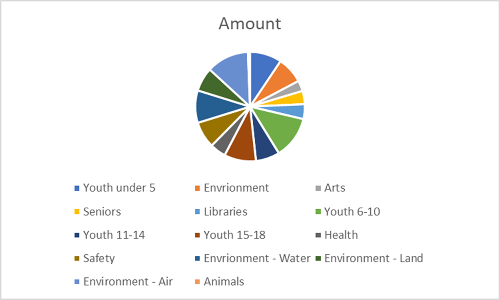
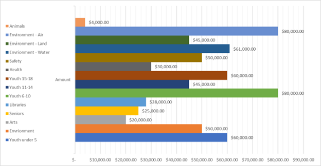
Let’s say an organization member wants to influence board members to invest more of grant dollars into working more with animals.
This chart shows the breakdown by spend within this organization with their grant dollars. But, the legend fails to give an easy breakdown of how the categories relate to the pie chart. Also, the figures or percentages are not displayed, making comparisons difficult.
Now, in this pie chart, the percentages have been added to help reflect the amounts in comparison to one another. But with the current legend displayed, it’s difficult to compare and contrast or to ultimately refine the board members attention to critical detail.
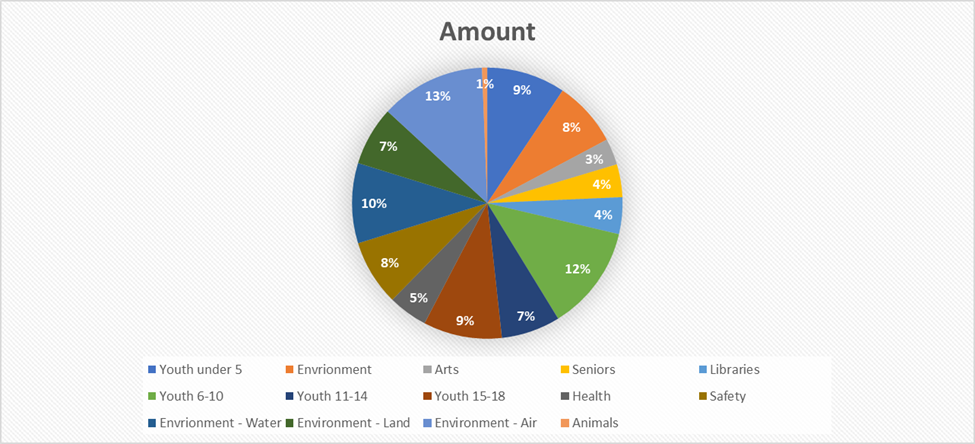
So, if our goal is to focus on how little we have put money into Animal programs, then we should highlight that comparison visually. In this graph, the amount for Animals shows a stark contrast easily. Additionally, it shows the lack of resources for that category in comparison to others.
Example 2:
Now, let’s explore colors to highlight and focus attention on key points. For example, let’s say we are trying to highlight the comparison of CO2 emissions between countries. Assume that the U.S has high CO2 emissions.
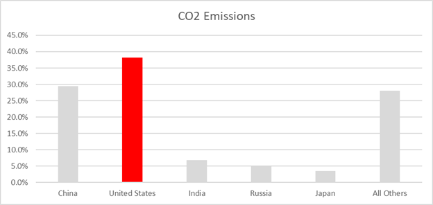
Negative and dominant colors such as red are known to reflect “danger”. This allows the audience to focus on the point you’re making but still have other data for comparison. Consider if that same bar was colored a cool blue or neutral green. It would deflect the audience from your point.
The Key To Storytelling With Data
A few key parts of storytelling with data include:
- Use visual cues to draw your viewers attention to where we want to highlight. Don’t expect them to read all the details on a slide and figure it out.
- Show your audience that you’ve considered their potential questions before they even open their mouths. Take them on the journey that you went through to drive your conclusion.
- Connect the dots so the audience knows how the elements in your story are related. Ensure they are not just circumstantial. Use visualizations to get your point across.
- Connect your findings to support a recommendation or outcome we want to get to.
Conclusion
Storytelling with data can be an incredible way to improve your influence and drive business intelligence. Data is the key to business empowerment, scalability, and growth. Without the art of storytelling, data is just a string of numbers that many managers, leaders, and executives are too time-poor to dissect. A staff member that can craft a story from data, is a staff member that will be recognized for asking the right questions and driving the right outcomes.
If you would like to explore storytelling with data further, connect with our expert team at SPK. Our consultants have years of experience with data visualization. Try flexing your data storytelling creativity through our data engineering and analytics services.

