There’s simply too much information. We all know this. So how can the “single pane of glass” (SPOG) dashboard simplify quantitative data? And why is data driven analytics of interest to companies?
Every day, more data arrives in our inbox – text messages, reports, and so on. Every application added to our work ecosystem to automate and support our tasks creates more data. How can we possibly keep on top of all this and extract meaningful insights from vast data sets?
Enter the single pane of glass.

But before we dive into that, let me tell you a story about data….
Why is data driven analytics of interest to companies?
I’m Chris McHale, the CEO of the technology services company SPK and Associates. At SPK, we love data – and we love tools. We have tools that support our knowledge work, automate manual tasks and ensure we do the right things at the right time.
Additionally, these tools provide us with a treasure trove of data insights telling us what to change, what’s going right and equally important, what’s going wrong.
As the company grew, so did the data. Through this evolution I relied more and more on data reporting to tell me what was going on. I could no longer rely on knowing anecdotally, or personally, what the issues were. So, I relied on the reports coming from all our applications, along with many (too many!) staff meetings to ensure I had the right business intelligence.
After a while, I realized that the tables and charts often obscured the insights I needed. There were too many numbers and simply too many things to look at that drained my time. The application reporting would only format a certain way. Or, there was no report for what I wanted. So we transformed the tables and charts into dashboards.
Why data analytics is important.
A dashboard is a huge step forward in wrestling data into submission. This is why data analytics is important. First, human beings are visual creatures and visual imagery resonates quicker for us than an array of numbers. A picture really can tell a story much quicker and one can gain better insights more easily. Simplistic, visual dashboards do the cognitive work for you, allowing you to extract meaningful insights with minimal effort. A dashboard allows you to focus on the important information, and not get distracted by the extraneous information.
Second, a dashboard has the brilliant ability to drill down into detailed information,giving you more insights into a particular area. But only if you need them. Instead of muddying the waters at the higher level, it provides the manager or leader with a clean picture. Then, if you want more detail, it provides it with a simple mouse click or two. Basically, dashboards are intuitive.
I loved my dashboards. I had a dashboard within each application, which typically corresponded with a company pillar, and details at my fingertips.
But, quickly, the shortcomings of our approach became painfully evident.
The challenges of data analytics.
I was relying on the reporting tool resident in each of the applications we used to run our business. Like most companies, we don’t have one application that does everything. We have a CRM for Marketing and Sales, we have a Marketing Automation tool, we have a Service Desk system, a bug tracking system, a professional services automation application, an accounting application… the list goes on. Each time I wanted information, I had to go to the application that served that area and find the pertinent dashboard.
Two problems emerged:
- Time vs effort: It was too cumbersome to move from application to application to review data.
- Comparative data: I couldn’t gain insights from correlating the data between the applications, because no dashboard existed that spanned the data sets.
This is where the SPOG – single pane of glass dashboard – came to the rescue.
What is the meaning of Single Pane of Glass?
Techopedia gives the following as a definition of “single pane of glass” dashboards:
SPOG management consoles import data from disparate sources and present it to the user as single source of truth.
The ability to create a visualization of data from multiple applications or sources is a game changer.
Let’s see how this impacted my business, and my view of it.
We decided to use Microsoft PowerBI as our visualization and dashboard tool. There are other good ones that we utilize for client work, such as Tableau, or Grafana, but PBI fit our needs well. If you’re interested in an overview list of visualization tools, I found this blog quite helpful.
My needs, as a CEO, are related to the whole business. We are a Services company, so our KPIs are about our people, their productivity, and project performance. Besides these, we care about the things everyone cares about – Marketing and Sales metrics, financial metrics, customer satisfaction metrics, and so on.

Building a SPOG dashboard.
I needed a SPOG dashboard that gave me an overview of each company pillar: Finance, HR, Operations, Marketing/Sales, and Leadership. However, a manager working in one of these pillars – say, a Project Manager – could be given a SPOG dashboard just for Operations, and even just for the projects they were responsible for. Whilst addressing my dashboard needs, I was also creating valuable visualizations for my managers, and their engineers. And we all know that good data drives empowerment within a workforce.
My SPOG dashboard gathers and correlates data from six or seven application data sets. Then, I am able to look at the relationships between Sales and Operations, HR and Operations, for example. No longer do I have to visit multiple applications with multiple logins. I simply go to one place and get the insights I need.
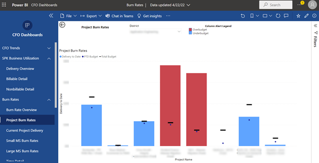
Here’s an example of a helpful insight I gained. Before my SPOG dashboard, I struggled with relating 2 separate metrics – one metric showed project delivery performance, and another metric showing productivity of staff. By visualizing these together, I can now see the correlations between the two, and make better business decisions about project planning and hiring. These insights are quick and painless. They no longer require additional work from someone on the team.
Data analytics to drive business intelligence.
I am finally able to focus on the important data and ignore the data that doesn’t matter. It’s easily available, and updates automatically.
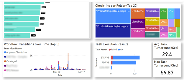
Recently, SPK has been creating many single pane of glass dashboards for our clients. We include this service when we manage or support applications for a team. Business leaders at our clients are thrilled to have easy-to-use visualizations of their team’s metrics. On the product development side, the visualizations have included ECO Turnaround Time, check-ins per project, workflow transitions over time, and more.
How to create a Single Pane of Glass dashboard.
Here are some essential steps to get you started.
Identify a key data set.
Ask yourself, what questions do I have about my group’s performance or work that I can’t answer at all? What questions do I have that I can’t answer easily? Does my business spend time every week or month putting together a report? Is there any application reporting that’s not easily accessible by everyone on my team? Pick one data question to answer that will help you make decisions more efficiently. Write it down. This is the foundation of your single pane of glass.
Pick a data visualization tool.
Don’t get too distracted with this. Pick something simple, or a tool that someone on your team knows. You’re only focusing on one data question right now; you can always change the tool later.
Identify the data sources you need to answer your question.
This can be tricky. To do this, you will need to understand the structure of your data. Once you have this, you can create accurate and meaningful visualizations to answer your data question. Are you collecting the right data to answer your question? Is your data accurate?
For a simple data question, you might only need 1 or 2 application data sources. If you get too complex, you might find yourself in a situation needing data engineering work, or needing to create a data lake. Keep it simple to start.
Experiment with visualizations.
Channel your inner designer and analytic. It’s an odd combination. The analytic needs to ensure that the visualization is telling the correct story, answering the question accurately. The designer needs to find the “right” picture that gives insight, and answers the question easily.
Once you’ve got one visualization done on your single pane of glass dashboard, you’ll have a sense of the value, and what it will take to continue on.
Conclusion
The ability to accelerate business growth and performance has a direct correlation with the ability to extract meaningful data insights. As visual creatures, humans can easily digest high level pictorials much more efficiently than a vast data array. And equally important, having the right data insights drives business intelligence and an empowered workforce.
Tools like Microsoft PowerBI, Tableau, or Grafana can all support simplifying insights through great data visualization. You can use these tools to create a single pane of glass for your business data. But it is critical that you have asked the right questions to identify the right visualization outputs. This can be a complex task for businesses, particularly those already time-poor due to pressured business KPIs and deliveries. If you need any help with your SPOG dashboard, we’d love to hear from you.
How about you? Have you created SPOG dashboards, and have they made your decision-making easier?