This short blog post is designed to show you the top five PowerBi training tips and tricks from our experts at SPK and Associates.
Microsoft Power BI is constantly evolving. More importantly, Power BI enables you to turn data into business opportunities. So, keeping on top of those updates and finding faster ways to complete tasks enables you to uncover business opportunities more rapidly. Identifying the best PowerBi tips will speed up your workflow and keep your stakeholders well-informed. Sarah Craft, resident Power Bi expert at SPK shares her five favorite insights for you to become a powerful Power Bi guru.
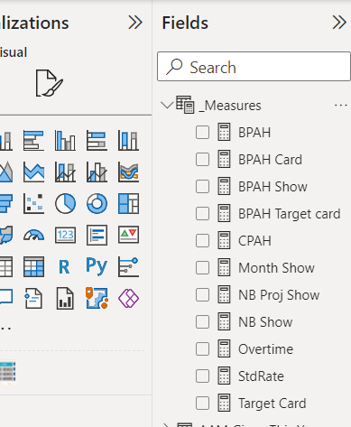
1. Keep Measures Organized In Your Measure Table
It’s easy to lose track of measures when you have multiple tables. By creating a measure table to keep track of all your measures you can keep those critical measures organized well.
Power BI Training: How to create a Measure Table
- Create a table using the “Enter Data” button in the “Home” tab
- Name the table “Measures Table”
- Measures can be created directly within the table. Also, you can add an existing measure to this table. So alternatively, change the Home table designation when the existing measure is selected
- To keep your Measures Table clean, right-click the blank “Column1” empty column and select “Hide”


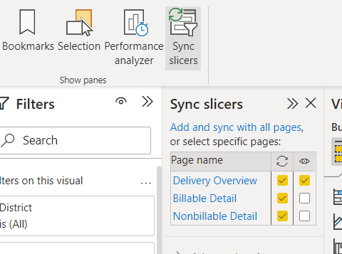
2. Utilizing Slicers Across Multiple Pages In Report
Some filtering is needed across multiple or all pages in a report. Slicers allow us to choose specific values or value ranges. Syncing slicers allows us to reflect filtering across all pages and show the slicer if desired.
Power BI Training: How to use Slicers
Don’t want to include a slicer on the page that is being filtered by a slicer on a different page? No problem. You can include a card graphic that states the filtered values using DAX code: CONCATENATEX(VALUES(Table[ColumnName]),Table[ColumnName[,”,”)
3. Creating Dynamic, Custom Titles In Visualizations
Sometimes you need the title of your visualization update or be customized based on your current data. By default, titles for visualizations are fixed text. You may also see these referred to as “Expression-based titles”. These titles can significantly enhance the appearance of your reports.
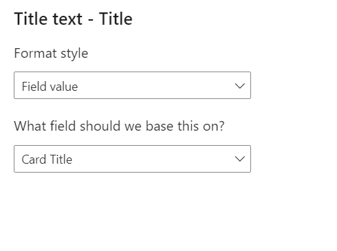
Power BI Training: How to use dynamic, custom titles
- Create a calculated column or measure that reflects your customized title. For example: Card Title = “Balances as of “ & SELECTEDVALUE(Table[Date])
- Select the visualization that you want to create a customized title for
- Select the “Format Visual” pane and then select the “General” tab
- Expand the “Title” menu
- Click on the “fx Conditional Formatting” button
- Under the “Format Style” menu, choose “Field Value”
- Select a customized column or measure that reflects the dynamic title

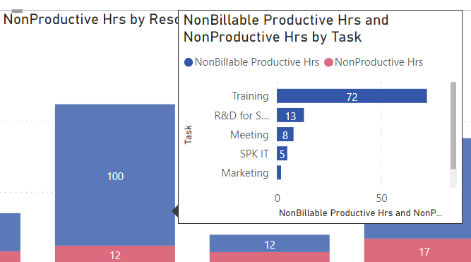
4. Utilize Pop-Up Detail Tooltips
Instead of drilling through visuals to view value details, we can create pop-up tooltips that show mini-reports on the same page.
You can create visually rich report tooltips that appear when you hover over visuals based on the Power BI pages you create. Equally exciting, there are no limitations to how many tooltips you create.
Power BI Training: How to use pop-up detail tooltips

- Create a new page within your report and name it with your mini-report title
- Select the “Format Page” pane and expand the “Page Information” menu
- Turn on the “Allow use as tooltip” button and name with the mini-report title
- Create a visualization that you’d like to show up as your pop-up detail on the main page
- Return to the main page and select the visualization the pop-up tooltip should appear on
- Select the “Format visual” pane and then the “General” tab
- Turn on the “Tooltips” button and expand the “Options” menu.
- Select the “Report” page under the “Type” dropdown menu
- Select the “New mini-report” page under the “Page” dropdown menu
- The tooltip pop-up will now display when hovering over values in the visualization.
5. Get The Best Visualization By Data Type
In a world with an abundance of complex data, it can be hard to focus on the critical take-outs quickly. Additionally, data can be misleading if it is not presented in easily recognizable format. However, an organization with powerful data can also make powerful decisions. Data drives business intelligence when it is presented well. Badly presented data can do the exact opposite.
By creating Power BI visualizations that are tailored to data type, you can ensure your audience and stakeholders are focusing on the key information.
Power BI Training: How to Choose Data Visualization By Data Type
- General Data – this is best displayed by using the Vertical Bar Graph
- Rankings – these are best displayed by using the Horizontal Bar Graph
- Time Series – these are best displayed by using the Line Charts option
- Comparing two values of different types – these are best displayed by Line and Column Charts
Conclusion
Microsoft Power BI is a powerful tool that enables you to turn data into opportunities. It drives business intelligence. Loaded with tools that allow you to customize the visualizations of your data, Power BI can help you make complex data simple.
With these five top tips for Power BI, you can start to create meaningful insights for your audience and stakeholders.
Looking to upskill your team with some expert Power BI training? Or want to integrate Power BI into your team’s workflow? Contact our team today to get started.


